Millions of us around the world eat at restaurants every day with our family, friends, co-workers, clients, parole officers…just kidding. Restaurants serve an important purpose in our lives – a purpose that has less to do with food and more to do with the way we connect with one another.
The restaurant has been around, in some form or another, since ancient Rome, and its function – to bring people together over a conveniently cooked meal – has changed very little in all that time.
There’s another benefit of restaurants that specifically applies to designers and other creative people, and that is to stimulate your creativity. That’s right – it’s been proven that socializing improves your intelligence. Not just academic intelligence either – interacting with friends and peers actually helps to make you more creative.
When you go out with others, you’re exposing yourself to an influx of new ideas which can’t help but positively influence your creative process. And food is a natural bonding agent, which is why so many creative ideas are born around a lunch or dinner table with other designers, artists, musicians, writers, et cetera.
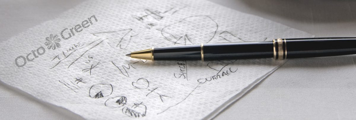
Today, I’m going to explore the idea generation process familiar to so many designers who eat out with friends: the “awesome idea scribbled on a restaurant napkin” process. It’s very high-level stuff. No, really! The lowly napkin sketch (or scrap paper or ledger pad sketch) has been used by everyone from babysitters all the way up to top creative executives at Microsoft and Walmart to bring to life important ideas that change the world, or at least bring in more profits.
Some experts say that the business sector is too dependent on language to express ideas that really should be expressed using visuals (i.e., sketches). That’s good news for us designers, but how exactly do we adapt it to our working process to make things easier for ourselves and our clients?
Scribble Scrabble
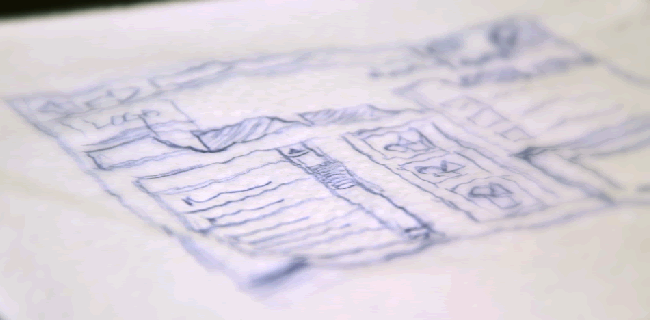
We designers all know the advantages of sketching: it’s a way to sort out our preliminary ideas and eliminate the ones that aren’t right for the job. Of course, you don’t have to sketch on a napkin, but any kind of sketch is more useful than just thinking about the idea, because it requires you to use a different part of your brain.
When you think, or read, or write, you’re nurturing the connections your brain makes between the different thoughts you have (called ‘neural pathways‘), and increasing your brain’s “elasticity.” When you add drawing to that process, you’re exercising important motor skills that can actually feed your creativity.
Personally, I prefer to sketch on paper. Why? Because it allows me the opportunity to step away from the computer for a brief moment and collect my thoughts on something I can touch and hold in my hands. That’s important to me, and to a lot of designers whose work almost always ends up on the computer one way or another.
We humans respond to things that are interactive and that allow us to make a direct impact on something. Ever wonder why more and more vending machines are see-through, rather than opaque? The working mechanisms of those machines are engaging to our brains – we love to put our money in the machine, and literally see our desire (to have a refreshing beverage or snack) being fulfilled right before our eyes. It’s fun. And guess what? Your clients are the exact same way.
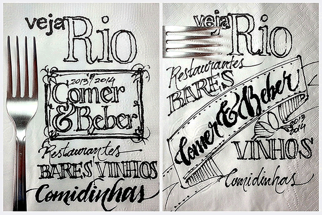
If you’re a designer or art director redesigning a company’s brand identity, how do you make sure everyone there understands the creative vision you have? Well, you could tell them. But most people aren’t going to take notes and will end up misinterpreting what you said at some point or another.
You could show them a presentation, which might work for some people. But I think that printing out handouts of your sketches, and walking people through them is the best way to involve them in the decision-making process.
Sometimes, sketching can be used to effectively communicate ideas to people – designers or non-designers – in ways that far surpass, say, a PowerPoint presentation. Think about what you’d rather have in a department meeting: a dry, preachy collection of slides, or a sketchbook to work out your ideas about the company’s creative direction?
Just like a clear-windowed vending machine allows us to see the effect our money has on it, involving people with live sketching gives them a democratic insight to how design decisions are made. It can turn a lofty, complicated mess into something that’s easy for everyone to understand. And we all know that an informed client is a happy (and oftentimes repeat) client.
Scribble Scrabble
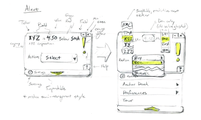
We designers all know the advantages of sketching: it’s a way to sort out our preliminary ideas and eliminate the ones that aren’t right for the job. Of course, you don’t have to sketch on a napkin, but any kind of sketch is more useful than just thinking about the idea, because it requires you to use a different part of your brain.
When you think, or read, or write, you’re nurturing the connections your brain makes between the different thoughts you have (called ‘neural pathways‘), and increasing your brain’s “elasticity.” When you add drawing to that process, you’re exercising important motor skills that can actually feed your creativity.
Personally, I prefer to sketch on paper. Why? Because it allows me the opportunity to step away from the computer for a brief moment and collect my thoughts on something I can touch and hold in my hands. That’s important to me, and to a lot of designers whose work almost always ends up on the computer one way or another.
We humans respond to things that are interactive and that allow us to make a direct impact on something. Ever wonder why more and more vending machines are see-through, rather than opaque? The working mechanisms of those machines are engaging to our brains – we love to put our money in the machine, and literally see our desire (to have a refreshing beverage or snack) being fulfilled right before our eyes. It’s fun. And guess what? Your clients are the exact same way.
If you’re a designer or art director redesigning a company’s brand identity, how do you make sure everyone there understands the creative vision you have? Well, you could tell them. But most people aren’t going to take notes and will end up misinterpreting what you said at some point or another.
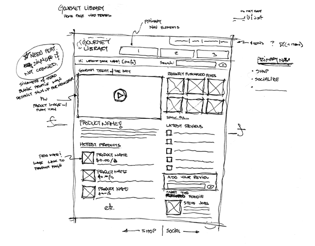
You could show them a presentation, which might work for some people. But I think that printing out handouts of your sketches, and walking people through them is the best way to involve them in the decision-making process.
Sometimes, sketching can be used to effectively communicate ideas to people – designers or non-designers – in ways that far surpass, say, a PowerPoint presentation. Think about what you’d rather have in a department meeting: a dry, preachy collection of slides, or a sketchbook to work out your ideas about the company’s creative direction?
Just like a clear-windowed vending machine allows us to see the effect our money has on it, involving people with live sketching gives them a democratic insight to how design decisions are made. It can turn a lofty, complicated mess into something that’s easy for everyone to understand. And we all know that an informed client is a happy (and oftentimes repeat) client.
