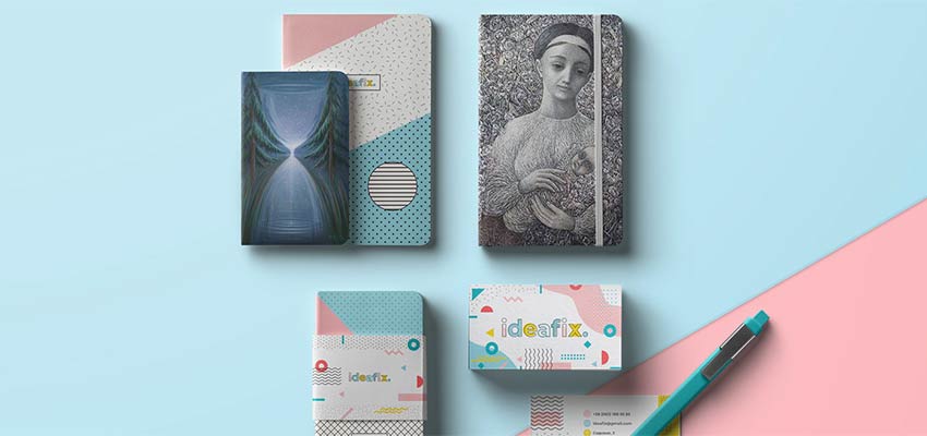
Colorful schemes and geometric solutions were named two leading trends in the graphic design sphere earlier this year. Many respectable artists and analysts have bet on these two approaches to prevail in 2019. And their predictions are coming true. Bright visual identities as well as those that feature clever geometric compositions appear here, there and pretty much everywhere.
Even though these two trends perfectly exist on their own, offering designers a vast scope of opportunities, it seems that they can make a cute couple and produce an even more significant impact together. This alliance is not just a colorful scheme used in tandem with a geometric approach. It is a true symbiosis where splashes of color are enclosed within various geometric frames.
Sometimes they interact with each other, sometimes they work separately. Nevertheless, together they create unique abstract scenery that adorns the backgrounds of various elements of brand identity – starting with business cards and ending with packaging. Colorful and shaped designs are a trend-within-a-trend that excites the audience and encourages designers to practice their creativity.
Personal Branding by Allyssa Ellis
We are going to start our collection with a representative example, Personal Branding by Allyssa Ellis.
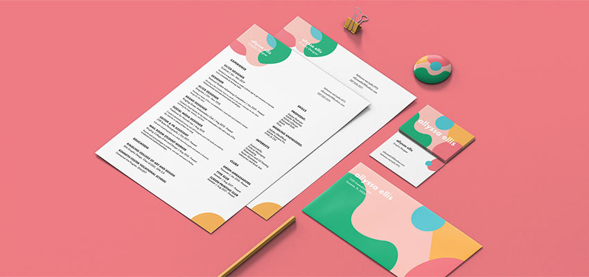
The goal behind this branding was to introduce Allyssa’s bright, fun and charismatic personality to the audience. And she has nailed it. The brand identity establishes a positive mood from the first look here. The shapes are smooth and feel elegant, whereas the color scheme is pastel. That adds to the feminine atmosphere. The project is fully in line with the artist’s creative thinking and character.
YOUNG GUNS 16 (YG16) Floating Award
The design will take you aback with its bright personality. Even though the chaotic explosion of vibrant tones has been coordinated here, nevertheless it feels like an artistic outbreak.
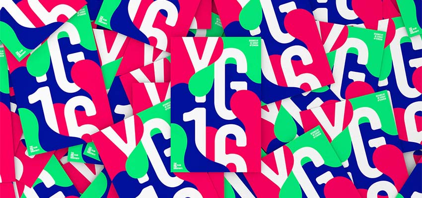
The project aims to represent young creatives, so it is not surprising that it has such a bold and a bit strange appearance. Note how the colors overlap letters here, erasing the border between foreground and background. The idea is just brilliant.
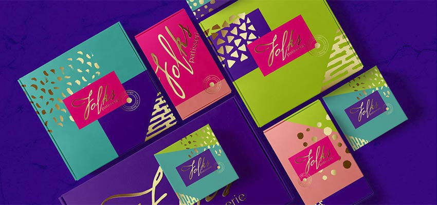
Identity and packaging design for Folks patisserie
Unlike the two previous examples that exude eagerness of youthfulness on all fronts, this brand identity project looks mature and stately. Golden blotches of various shapes give the composition a bit of luxury feel. Note how easily and naturally the artist managed to combine such drastic colors as lime and turquoise. They have pulled off a fantastic result.
Museum Identity
Created by Kristina Hristova, this project looks positively odd. It certainly has an artistic quality that sets the tone to an appropriate one for the museum theme. It seems like one of the installations from the modern art gallery.
Each flyer strikes an eye with its intricate design, with well-thought-out layering and color combos. At some point, it even reminds us of a scrapbook style. Yet with some modern tricks and moderate usage of layers. This project naturally breaks away from the rest of the crowd.